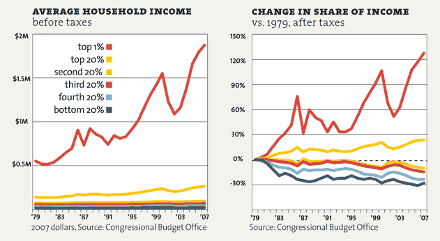
As noted countless times in this blog, the shift to a more supply-side (aka Reaganomics/trickle down economics) economy has not led to a stringer middle class. The disparity in wealth and income between the top 1% and everyone else (especially the bottom 4 quintiles) has only widened and left many of the lower quintiles barely able to afford the costs of living. Nevertheless, apologists have used a few distortions to diffuse this inconvenient fact.
Using average income gains instead of median
If Bill Gates walks into a bar, the average income of the people in the bar rises dramatically. But it doesn’t mean anyone in the bar now actually makes more money. Likewise, the last 30 years has seen a sharp rise in wealth for the very top earners, so indeed, the average has risen.
Focusing household income instead of individual income
Double income households are far more common than they were 30 years ago. So while individual income has been reduced, households have compensated by having two working parents. This may be another factor to consider when dealing with criticism over a ‘failing school system’ (parents have less time to tend to their children’s upbringing relative to 30 years ago). It’s also important to consider how the added costs of things like dependency on prepared foods, gas and child care costs partially offset these gains.
Focusing on compensation instead of earnings.
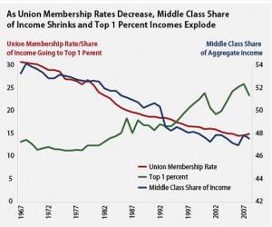
Even if incomes have indeed stagnated for the middle class, increased employer compensation likely makes up for this. In other words, when factoring in things like health care, middle class ‘income’ has likely kept pace. This argument appears to depend on averages to make the case, because compensations has certainly increased for the top earners, and this pulls the average upwards. But as Kenneth Thomas points out, by separating added compensation between workers and higher earners, compensation for most workers still drops compared to its peak in 1972.
Furthermore, the rising costs in health care is likely another source of continued income disparity as employers who provide health care have offset these costs through lower wages. This would argue for the single payer or at least a public plan which would relieve employers of this added cost and put small businesses on equal footing with their larger counterparts who can offer more attractive benefits due to the added bargaining power of having hundreds of thousands of employees on a health care plan.
The “quality of life” response
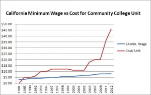
The last few decades has certainly seen an increase in technological advancement. The internet, smart phones, and much certain products (like large screen televisions) are far more affordable than they were. So the argument goes, the average person has more access to more things. And this is indeed true. But it’s important to note the offset of this. Health care and tuition costs have skyrocketed. Workers are far more likely to deal with traffic and longer commutes. Union-busting has made job security largely a thing of the past.
The Consumption Non Sequitur
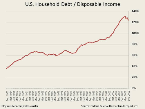
Some apologists claim that measuring consumption over time is a better metric than income. And by showing that the disparity in consumption isn’t as wide as the wealth/income gap, they claim that the inequality argument is overstated. The problem here is not that this argument is wrong, but somewhat irrelevant, because the rise in household debt would seem to argue that households have had to rely on credit in order to maintain a certain level of consumption.
Splitting only between the 1% and the 99%
The Occupy Wall Street movement was able to summarize the wealth disparity into a sound byte with its focus on “the 1%.” And indeed, the 1% has pulled away far more than the remaining 99%. However, the gains extend to more than just the top 1%. By including the top decile of income earners into the comparison, apologists make the claim that the middle class has actually made some gains.
Focusing on rising incomes by age group
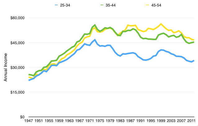
Another common response goes like this: people generally move up the income latter over time. They rarely stay in the same bracket. The problem with this (as shown on Junk Charts) is that even when splitting income earners by age groups, we still see the income disparity taper off across the age groups
Another conclusion we might draw from this chart is that median incomes for men were somewhat volatile depending on what political party was in power. Incomes decreased under every U.S. Republican President except Reagan (where it went up), and increased under every Democratic President except Obama (it’s too early to tell based on this data). Bloomberg’s analysis didn’t take any of this into account.
All of the above
Some apologists throw the kitchen sink and mix and match the above arguments to make their case seem stronger.
Further Reading
- It’s the Inequality, Stupid
- 15 Mind-Blowing Facts About Wealth And Inequality In America
- 15 Facts About U.S. Income Inequality That Everyone Should Know (CHARTS)
- Striking it Richer: The Evolution of Top Incomes in the United States
- American Pie:Wealth and Income Inequality in America
- Here Are Four Charts That Explain What The Protesters Are Angry About
- On the Issues
- On Economic Inequality
